Description – The colours in your office can greatly impact your employees. Check out our blog to learn how to spruce up your workspace with the right colour scheme.
While certain environments make you feel duller, do you find yourself happier around certain colours? Have you ever thought about why being surrounded by nature brings the best emotions in you and why a busy city and traffic bring frustration? Our surroundings play a huge role in defining our personality and mood at a said time. The yellow and black used by Bumble and Google’s green, red, yellow and blue are more than just colours in their logos, they have, in fact, over time become synonymous with these brands, and so it is logical that these colours are also reflected in office or workspace interiors. But why do colours in the workspace matter?
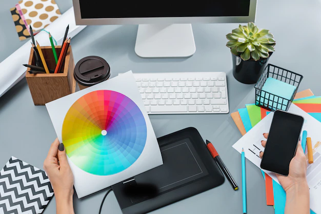
Colours can help to create an illusion of a bigger or a smaller room. If the room is small and the amount of natural light is limited, light colours are the way to go. If the room is large, darker colours create a cosy, comfortable environment. So pick up the colour scheme chart and get started on the adventure to spruce up your office interiors! Before we get started, however, let’s better understand what a colour scheme is.
What Is A Colour Scheme?
A colour scheme can simply be understood as a combination of different shades of colours or colours in general that are related or connected to each other in certain ways. To list a few, we have the primary colour scheme, the secondary colour scheme, the monochromatic colour scheme or the analogous. While it may seem complex, upon a closer look, these are actually pretty straightforward.
The Different Types of Colour Schemes To Choose For Your Workspace
Now that you know what a colour scheme is, let’s move on to the different colour schemes you can choose for your workspace.
The Blend of Primary & Secondary With Warm & Cool Colours
Primary colours have been understood as those that can later be mixed to form other shades of colours. Secondary colours are those that are formed by mixing the primary shades. Warm and cool colours are categorized as warm and cool due to the feelings one gets when looking at the hues. For example, reds, yellows, oranges are evocative of the sun and fire. Therefore, they tend to convey a sense of warmth and comfort.
On the other hand, the cool colour scheme is reminiscent of earthy objects, such as grass and water. These hues often feel cool and refreshing, much like the outdoor areas they are associated with. A mix of warm and cool colours coupled with a primary and secondary colour base will provide a balance and a more defined contrast between the different hues. Here are some great options to choose from:
Blue
Looking for a way to boost creativity and liven up open-plan workspaces? Blue is also a go-to colour for brainstorming and detail-oriented work. Moreover, the colour is known to have a calming and soothing effect while promoting trust and communication. It also improves efficiency and focus. In terms of health benefits, blue lower heart rate, blood pressure and respiration. Hence, you should consider using blue in collaboration spaces, like meeting rooms or research areas.
Yellow
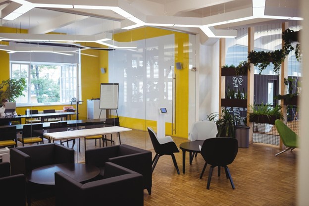
Looking for an optimistic and cheerful colour that instantly livens up spirits? The colour of sun and fun, yellow is a welcoming, energising colour that can serve your purpose. Yellow is also known to encourage focus and direction and promote innovation. It’s best used in creative, active environments.
Red
Red is your go-to colour if aspiring to foster increased efficiency but shouldn’t be used in vast spaces and is more commonly seen in break-out spaces and smaller meeting rooms where it doesn’t overwhelm the eyes. Some of the best areas to use red include the office cafeteria, spaces with movement (e.g. hallways) or areas where people work late at night.
Green
Being a natural and earthy colour, green can have a calming impact and is less harsh on the eyes. Further, it can reduce fatigue and boost creativity. The colour green also promotes harmony and balance, reduces anxiety and reduces eye strain. Some of the best rooms to add green include desk-based workspaces, lounges, employee relaxation areas, and others.
The Monochromatic Colour Scheme
This colour scheme is often misunderstood and sold short for being boring. Monochromatic does not mean one colour in one value used throughout a room. While the word monochromatic literally means one colour, in decorating, it actually means that the colour will be refined in a few ways to create a comfortable space.
Neutral colour schemes can also be monochromatic, with variations of a neutral colour. By choosing one colour and using tones, shades, and tints, of that same colour, you can add that variation and liveliness your space needs. Using variations of the same colour can make a room look larger, so it’s great for decorating small spaces, too, in case space is a constraint.
The Analogous Colour Scheme
The analogous colour scheme involves three hues, all of which are positioned next to each other on the colour wheel. While neutrals can also be added, two of the shades involved will be a primary colour (red, blue, and yellow), and the third will be a mix of the two. Look to nature to inspire your palette, and understand that smaller touches of this colour scheme, with neutrals as a base, can go a long way.
The Complementary Colour Schemes
Complimentary colours are exactly opposite to the primary colours of the colour wheel; red and green, yellow and purple, and finally blue and orange. The complementary colour scheme can appear intimidating if you’re unsure of handling bold colours. But the trick is knowing how to use them in their right proportion and tincture, and you’d be surprised with the number of impressive combinations you can get out of them. These schemes are bold, dynamic, and, in contrast to popular belief, can create some stunning spaces.
Creative Ways To Add Some Colours To Your Office
As companies are settling with new ways of working and with staff increasingly spending more time away from the desk, colour has come to play an even greater role when defining workplace spaces and subtly denote what these spaces are designed for.
Collaborative and agile working spaces generally utilize brighter, more vibrant colours to inject energy and creativity. In contrast, areas designed to facilitate concentrated working opt for softer, more muted tones, with blue and purple being popular choices. While designing a space, it is important to not just look at the colour of walls but to also look at injecting colour through office furniture, the ceiling, the flooring/carpet and also by using natural surfaces/textures like rustic benches or living walls to introduce some earthy tones.
Another way of injecting colour into the workplace is through graphics, artwork and features like living walls which have proven popular. Incorporating art into the workplace can have a majorly beneficial impact. Flooring can add a base or pop of colour to help define a space.
Architectural features such as stairway rails and lighting are unexpected elements that can provide added colour. Natural elements like plants and water features add both texture and colour while bringing living items into space. You can also try accent colours with desk organizational systems, fake plants, or notepads. This is a great way to incorporate some energetic colours into your office in subtle and simple ways.
Find The Perfect Colours For Your Workspace With ANS
Hopefully, this article has helped reduce inhibitions and better explain the plethora of options your office has for you in terms of colour schemes and their effects. When done well and by experts, this initiative will almost always yield immediate results in terms of employee happiness and productivity. So, if you want to enhance your company’s performance and spark creativity within your employees through the magic of colours, we at ANS can help create an efficient office colour scheme. For more information, contact our team now!


